How do we move logical shorthands forward?
There are several proposals, but one major road block
We’re trying to make progress on shorthand syntax for CSS logical properties. But the path forward depends on where we hope to be a decade from now.

New layouts will be possible
The more I play with it, the more convinced I am that anchor positioning is going to unlock some surprising new layouts.
Check out our Winging It conversations about design, frontend, and backend development.
Winging It episode 8: CSS Anchor Positioning in Practice
Winging It episode 16: Debugging CSS Anchor Positioning
Many of the initial examples and use cases for anchor positioning are simplifying existing possibilities, and – don’t misunderstand me – anchor positioning will simplify how dropdown menus are implemented significantly.
But that’s just the start.
I first got a glimpse at the possibilities while watching the Anchor Positioning session at CSS Day 2024 from Tab Atkins-Bittner, an editor of the CSS spec. Hidden in Tab’s presentation on anchor positioning was the concept of using an anchored item as an anchor to ensure that anchored elements don’t overlap.
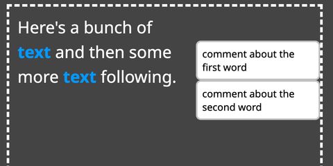
It’s a simple but powerful trick – in the demo, they are building side notes,
with words in a paragraph of text that are anchors for some additional content
displayed inline to the side. top: max(anchor(--word top), anchor(--note bottom)) will set the top of the note to the higher value of the top of the
anchoring word OR the bottom of the note above it.

This concept unlocks a lot of possibilities that I don’t think were easy to achieve before.
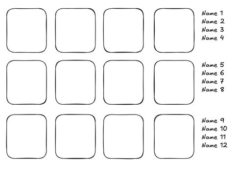
Imagine a high school yearbook’s photo spread. There are rows of headshots, and to the side of each row, there is a column with the names of each person in that row. It’s not a terribly difficult layout for print, but there are a few challenges to implement it in HTML.

First, it would be a challenge to have the name and the photo of each person together in the HTML. Also, if it needed to be responsive, with different numbers of photos per row, I’d likely have to have multiple layouts defined in CSS, and potentially duplicate the items in the HTML, and conditionally show them based on some magic number.
When working with anchor positioning, I’ve found it helpful to borrow the concept of constraints from mobile development, where you describe your layout in terms of relationships between elements. So, let’s start by defining our constraints:
1em to the right of the photos.This is all possible with anchor positioning, and we can even have the image and
name inside of the same <li>.
<ul>
  <li>
    <img src="photo1.jpg" />
    <h2>Name 1</h2>
  </li>
  <li>
    <img src="photo2.jpg" />
    <h2>Name 2</h2>
  </li>
  ...
</ul>
We’ll make the <ul> the main photo area, use flex-wrap: wrap to fit as many
photos in a row as possible, and make it an anchor by giving it anchor-name: --photos.
Then we can place the <h2> titles to meet the first constraint.
h2 {
  position: absolute;
  left: calc(anchor(--photos right) + 1em);
}
That’s right – we don’t need to first figure out how many pixels from the left
viewport edge the photos are, we can just declaratively describe what we want.
“Place the left edge at the sum of photos’ right side and 1em”.
We can then satisfy the second constraint, that each name should be in the same row as its photo.
li {
  anchor-name: --photo;
  anchor-scope: --photo;
}
h2 {
  top: anchor(--photo top);
}
The top rule simply aligns the top of the name with the top of the photo. The
anchor-scope is important here. By default, if there are multiple elements
that have the same anchor-name, the last element in the DOM will be selected.
Setting anchor-scope on a parent element means that the anchored element won’t
look outside of the parent element for an anchor. This means the <h2> will be
aligned with the top of its photo.
But wait – we have one more constraint. At this point, all the names in a row are layered on top of each other. We want them to vertically stack instead.
h2 {
  anchor-name: --title;
  top: max(anchor(--photo top), anchor(--title bottom, 0));
}
Now, the top of the name will be either the top of the photo OR the bottom of
the title above it, whichever is greater (or further down the page). That’s
because the anchoring element has to come before the anchored element, which
means the reference to anchor(--title) will be the name above it.
I’d recommend viewing this on Codepen
so you can resize the demo. I’ve added a short transition to the top property
so you can see how the names adjust as the names above them move.
See the Pen CSS Anchor Positioning - Yearbook layout by @jamessw on CodePen.
Note that Chromium released support for anchor-scope in version 131, but since
the polyfill doesn’t support partial polyfilling, this demo will only work in
Chromium before 125, after 131, or in a non-Chromium browser.
As an added bonus, because the photo and name are in the same <li>, we can add
hover effects so that if one is hovered, both parts are hovered. If the item is
a link they can be inside the same <a>.
What new possibilities for anchor positioning are you excited about? Let us know by sending us a message on Mastodon or BlueSky.
And if you’re excited to use anchor positioning before it becomes baseline, check out our polyfill. It supports enough of the anchor positioning spec to do most things.
There are two ways to help us keep this work sustainable and centered on your needs as a developer!
A huge thank you to the individuals and organizations sponsoring OddBird’s open source work!
We love contributing back to the languages & tools that developers rely on, from CSS & Sass to browser polyfills and Python. Help us keep that work sustainable and focused on developer needs!


There are several proposals, but one major road block
We’re trying to make progress on shorthand syntax for CSS logical properties. But the path forward depends on where we hope to be a decade from now.

Can we get this process unstuck?
The CSS Working Group recently resolved to add a size shorthand for setting both the width and height of an element. Many people asked about using it to set the ‘logical’ inline-size and block-size properties instead. But ‘logical shorthands’ have been stalled in the working group for years. Can we…

It’s not just a shorthand for anchor()
position-area might be my favorite part of the CSS Anchor Positioning spec, with a ton of features packed in to make things just… work. But there’s no magic here, just a few key parts that work well.